Directions
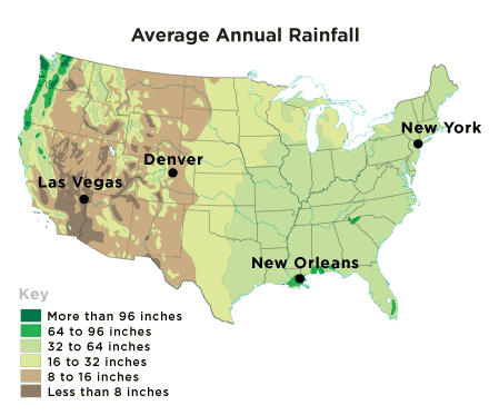
Bar graphs are good ways to compare differences between different items. The bar graph on the right shows the average annual amount of rainfall in four different cities. It is based on weather data collected from 1981 to 2010 for the NOAA National Climatic Data Center.
Use the information on the map to drag and drop the city name to label the correct bar on the graph.

