TV411

Tune in to Learning

Photosynthesis: Math Lesson: Activity 1 of 3

Prev ActivityNext Activity
DictionaryCalculator

Directions

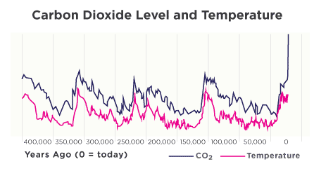
The level of carbon dioxide and global temperature is closely linked. Check out this graph. The dark blue line shows the level of CO₂ in the atmosphere. The pink line shows the temperature. Do the patterns look similar? When 2 sets of data like these share a relationship, we say that the 2 sets of data are correlated.

[+] Click to enlarge the image

The valleys and peaks of the data appear to be spaced pretty evenly across the x-axis that marks the passage of time. This means the rise and fall of CO₂ levels and temperature happen in a cycle, like the regular changing of seasons. Look at the distances between the major valleys. What’s the best estimate of how much time passes between each ice age?
PrevNext
Question 8 of 10